Boring vs. Attractive Visualizations: Bridging Perspectives and Expertise at Statistics Netherlands
Conference
65th ISI World Statistics Congress
Format: CPS Abstract - WSC 2025
Keywords: collaboration, communication, exploratory, infographic, interviews, pop-up, user-experience, visualization
Session: CPS 85 - Data Visualization and Communication in Statistics
Monday 6 October 5:10 p.m. - 6:10 p.m. (Europe/Amsterdam)
Abstract
We present the collaboration between the user experience team of the communication department and the methodology department at Statistics Netherlands. Historically, both departments have distinct cultures. The communication department has much experience and expertise regarding production of visualizations, and the methodology department has much scientific knowledge and expertise mainly from a functionalist perspective (e.g. Bethlehem, 2022). To explore the perceived interpersonal differences between the departments, to use these in our favor and to gain substantive knowledge on visualizing statistics, we conducted an exploratory user experience pop-up trial.
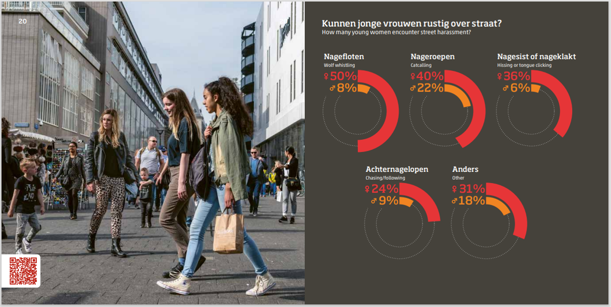
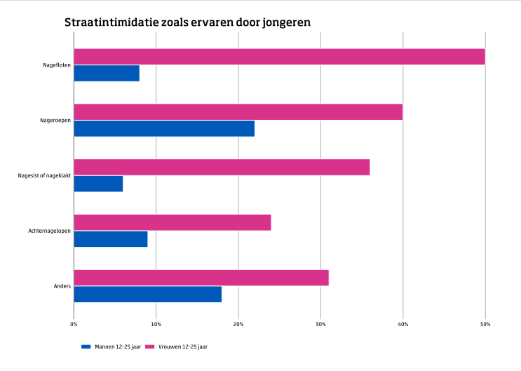
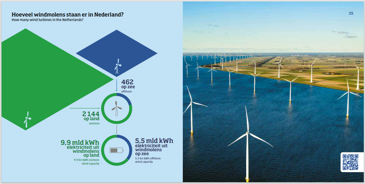
At a fast-food restaurant in downtown The Hague, we conducted structured interviews with 17 people recruited from the streets of central The Hague and observed and registered participants reactions to three visualizations. The differences between the methodological and user experience perspectives were playfully highlighted: an attractive infographic from the communication department was juxtaposed with its ‘boring’ but functional bar chart equivalent. These visualizations depicted street harassment, and we also explored an artistic visualization of wind turbine statistics with the participants. The attractive infographics were presented in a booklet with accompanying stock photos.
Our findings revealed that there is no ‘one size fits all’ visualization, as well as to be mindful of information overload. We observed that photos of people next to the infographics attracted attention and could influence the information's reception. Also we found that different purposes require different visualizations. Equally important was the newfound interdepartmental connection and mutual inspiration that blossomed under the fast-food restaurants fluorescent lights, benefiting Statistics Netherlands as a whole. We look forward to updating the audience on our latest efforts to effectively communicate statistical facts for societal benefit. The collaboration between the two different disciplines could be an inspiration to other organizations that are dealing with the question on how the combat statistical illiteracy and how to foster better understanding of statistical information among the pubic.
Reference
Bethlehem, J. (2022). Het grafiekenboek. Amsterdam University Press.
Figures/Tables
streetharassment_infographic

streetharassment_bar

wind_infographic

